Botswana Qualifications Authority
Learning. Progress. Possibility.
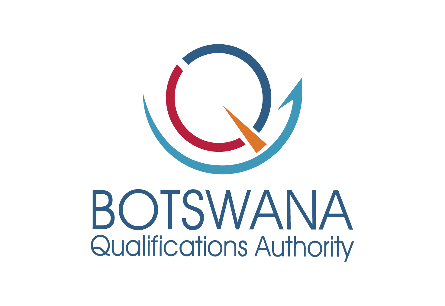
Each colour tells part of the BQA story, bringing together higher education, technical and vocational education and training, and general education.
Navy blue
Higher Education
Blue is associated with maturity, trust and knowledge.
Colour meanings: Smart, progress, launch, authority and trust.
Burgundy
Technical & Vocational Education & Training
Burgundy represents controlled power, determined ambition and dignified action.
The brand manual also describes it as a colour often favoured by the wealthy.
Aquamarine blue
General Education
Aquamarine blue is associated with trust and water’s life-giving force and beginnings. General education is the start and foundation of education.
The base represents this foundation, and the arrow represents lifelong learning. Pointing upwards, it expresses progress, success and the endless possibilities of quality education and training.
Colour meanings: Longevity, eternity, lasting relationships, friendship, life and harmony.
The radio tuning pointer symbolises focus: BQA is aligned and focused on providing cutting-edge qualification systems.
Colour meanings: Creativity, balance and friendliness; an inviting colour.
Colour meanings adapted from the BQA Brand Manual, page 7.